August 29, 2014
Two-way Sorting in Tableau - Sorting Some of the Viz by a Measure and the Rest Alphabetically
airport
,
calculated field
,
continuous
,
crosstab
,
date
,
delay
,
discrete
,
formatting
,
sparklines
,
table calculation
,
tableau
,
tips
,
travel
,
tricks
10 comments
I had an interesting requirement posed to me yesterday that I hadn't ever run into before. I'm using this Airline Delays data to demonstrate the technique. The requirements were along these lines:
 First, I have to calculate the % of flights that are delayed (a.k.a., the delay rate).
 Next, I built a simple crosstab with Date on the Columns shelf (I used continuous month and then converted it to discrete, but you can leave it as continuous without breaking anything), Airport on the Rows shelf and Delay Rate on the Text shelf. Also be sure to turn on the Show Missing Values option on the Date field.


 Next set of steps:


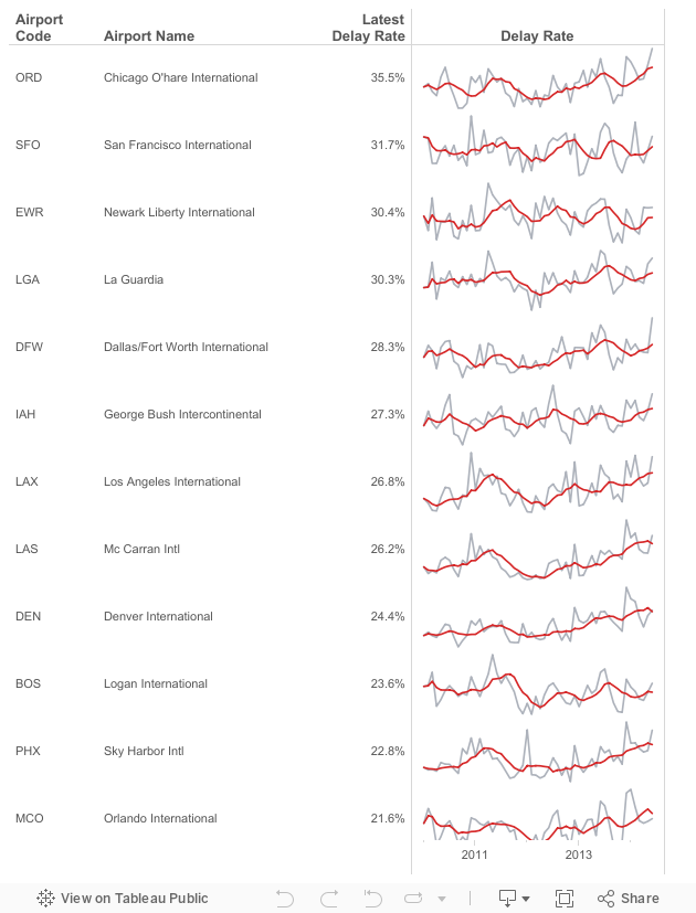
- Given a list of airports, there are a subset that are "targets". Let's assume they are the top 15 with the most flights in 2014: ATL, DFW, ORD, LAX, DEN, IAH, SFO, PHX, LAS, MCO, CLT, EWR, BOS, SLC, LGA
- The airports need to be sorted by the latest delay rate. However, only those in my top 15 list should be sorted by delay rate, the rest should be sorted alphabetically to make them easier to lookup.
- Include sparklines for each airport for 2010 to present.
This is the final product and here's how I went about solving this problem. There could very well be a more efficient method, but this worked for me.


Next, I created a calculated field to get the Delay Rate for the latest date.

Notice when I put this new measure in the table, I get the value for the most recent date in every column. Perfect so far.

- Change Latest Delay Rate to discrete and move it to the Rows shelf.
- Change the Date on the Columns shelf back to continuous.
- Move Delay Rate to the Rows shelf (to generate a line chart).
- Drag the right edge of the chart to the left to get a more sparkline-type look.

There's more cleanup to do later. Now I need to focus on the sorting. Recall that I need my list of 15 airports sorted at the top in descending order, followed by all of the remaining airports in alphabetical order. If I look at the sort options for Airport Code, Latest Delay Rate is not one of the options. That's because Latest Delay Rate is a table calculation and table calcs are not available for sorting.

I need to create a couple of table calcs that will do the sorting for me. I could do all of this in one calculated field, but I like separating out the pieces in case I need to reuse them. The first calculation takes the negative of the Delay Rate and also converts nulls to zeros. I set the Default Table Calculation to Date.

I changed the default for this measure to discrete and placed it as the first pill on the Rows shelf.

Ok...nice! My rows are now sorted by the Latest Delay in descending order. Now I need to apply this sorting to only my "target" airport codes.

I set the Default Table Calculation to Date and converted this measure to discrete. I then replaced the "Latest Delay Rate (neg)" pill on the Rows shelf with my new Airport Sort calc.

I shrunk the height of the rows so that you could see the target airports sorted by the value and the rest sorted alphabetically. Sweet!
What would be really nice is to have a visible break between the sections to indicate to the user that they're switching to alphabetical order. This can be handled easily by creating on more calculated field that checks whether an airport code is one of our target 15.

This calculation results in a boolean, so I have to change the default sort order so that True is first. I then placed it on the Rows shelf as the first pill.

Some of the additional steps I took:
- Hid the headers for Target Airport and Airport Sort.
- Added Airport Name to the Rows shelf since I don't know many airport codes by memory.
- Made the row headers bold.
- Right-justified the text for Latest Delay Rate.
- Made the Rows a bit wider again.
- Edited the Delay Rate axis: Changed the Range to independent and unchecked Include zero.
- Hid the header for the Delay Rate axis.
- Removed the gridlines.
- Removed the zero lines.
- Reduced the Row Divider Level (to give me the break between the target 15 and all others)
- Added a 6-month moving average delay rate to the chart.
- Made the chart lines thinner.
- Removed the title from the Date axis.
- Added a dummy header for the line charts.
- Filtered the Year to 2010+.
- Cleaned up the tooltip.
In the end this is how my canvas looked. Again, I'm 99.9% sure there's a more efficient way to do this. I could easily combine many of the calculations, but I don't like doing that because I find it harder to retrace my steps. Go back to the top to revisit the interactive viz. You can download the workbook here.

Subscribe to:
Post Comments
(
Atom
)


Andy -
ReplyDeleteI this is very thoughtful and an interesting solution. The one addition I might make would be that this seems like a perfect opportunity to use Sets in Tableau. If you actually had the data with the number of flights you could create a set on Airport for the Top 15 by number of flights. This would make the list dynamic over time and makes it so you could leverage a parameter to change the top n (top 5, top 20, etc...).
Certainly very thoughtful and a great use of sparklines and table calcs. Many thanks!
Andy,
ReplyDeleteI like the approach! You could use a set for the target airports. Sets can be used in calculations (the name of the set in a calc returns true/false at a row level based on whether that record is in/out of the set). It would be more efficient in terms of avoiding the typing of the targets and codes and might be easier to maintain. However, the resulting queries to the data source are likely a little less efficient than using a simple row-level calculation, as you did in this post.
Regards,
Joshua
Thanks Nelson & Joshua! I hadn't even thought about Sets, probably because I rarely ever use them. It would be really cool to somehow use a parameter so that the user can pick the Top X airports instead of using a hard-coded list.
ReplyDeleteI tried replacing the list of airports in the Airport Sort calculated field with a set but I keep getting the "Cannot mix aggregate and non-aggregate..." error. Here is the formula I'm using for the new calculated field:
ReplyDeleteIF [Top Airports]
THEN [Latest Delay Rate (neg)]
ELSE WINDOW_MAX(AVG(0))
END
I also tried wrapping the set with ATTR() but got a "ATTR is being called with (boolean)..." error. What am I doing wrong?
Maybe you can create another calc that evaluates the set and returns an integer instead of a Boolean and then use that.
ReplyDeleteYou're right, this fixed it:
ReplyDeleteIF ATTR(IIF([Top Airports],1,0)) = 1
THEN [Latest Delay Rate (neg)]
ELSE WINDOW_MAX(AVG(0))
END
**Note to self: The error messages aren't trying to trick you.
Awesome! Glad it worked for you.
DeleteA really nice walk-through, Andy. I've often used a solution similar to this to create a more relevant and organized viz for my users, and it's a great example of how powerful and flexible table calcs can be.
ReplyDeleteGreat post, Andy.
ReplyDeleteNow I gotta spend an hour digesting it... :-)
Newark Liberty International Airport (EWR) is located in New Jersey, about 15 miles from Midtown Manhattan in New York City. EWR forms part of the larger Port Authority of New York and New Jersey, which includes JFK International and La Guardia International Airport. more
ReplyDelete