November 9, 2015
Makeover Monday: The Highest Paid Positions in the NFL
Chart of the Day
,
Cork Gaines
,
distribution
,
DNA chart
,
dot plot
,
football
,
Makeover Monday
,
nfl
,
sports chart of the day
2 comments
Today was a perfect day to practice the “time-boxing” technique I use for makeovers. I worked on this as I headed to Northampton to teach a Tableau Fundamentals course for a customer. The train journey from Euston to Northampton is 57 minutes, and I completed this makeover in 42 minutes.
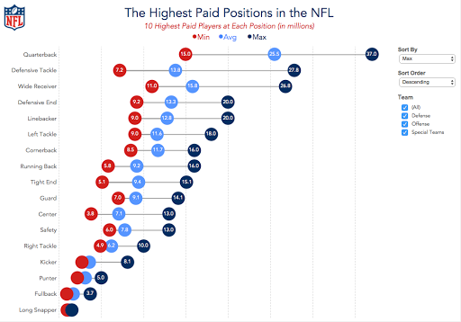
Ok, here we go. First, the chart to makeover today was by Cork Gaines of Business Insider.
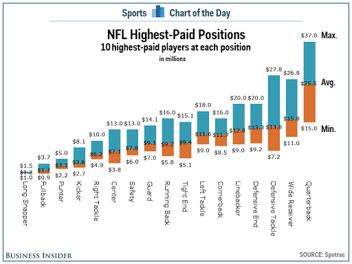
I really like the idea behind this chart: understanding the salary distribution of NFL players by position. However, there are a few problems with this chart:
To address these concerns, I’ve created the viz below. In my version, I’ve made the following changes:
This was a pretty simple and quick makeover that I feel provides a much more meaningful and insightful visualisation.
Ok, here we go. First, the chart to makeover today was by Cork Gaines of Business Insider.
I really like the idea behind this chart: understanding the salary distribution of NFL players by position. However, there are a few problems with this chart:
- The labels are vertical, making them harder than necessary to read.
- It took me a while to understand the sorting; the chart appears to be sorted by average salary.
- The salaries are only for the top 10 in each position, which means the min, avg and max are all relative to those 10 players.
- The labelling feels like it’s cluttering the chart.
To address these concerns, I’ve created the viz below. In my version, I’ve made the following changes:
- Changed the labels to horizontal
- Added options for sorting the viz by any of the metrics and allowing the user to pick a sort order
- Added a filter for the team the position belongs to
- Changed the chart from a bar chart to a dot plot/DNA chart
- Moved the labels into the middle of the dots, where they fit, and removed the $ symbols
- Changed the colours to use the offical NFL colours
This was a pretty simple and quick makeover that I feel provides a much more meaningful and insightful visualisation.
Subscribe to:
Post Comments
(
Atom
)


Hi Andy!
ReplyDeleteFirst of all, congratulations for all your help and work already did helping people to know better Tableau. You have done a great work. No question about it! I have learned a lot from you.
Any chance that you can explain step by step (or by a video) how do you get this visualization done?
I would really appreciate if you do this because knowing how to get this visualization will help me a lot in my present and futures jobs assignments.
I am looking forward for your answer,
HA
Hi HA. I already created a video for how to create these charts at the link below. The only difference is that the one above has 3 measures in play instead of 2. The technique is the same though. You should also download the workbook and try to dissect it yourself. That's a great way to learn. http://vizwiz.blogspot.co.uk/2015/06/dnacharts.html
Delete