December 21, 2015
Makeover Monday: Crude Oil Prices Have Taken a Dive Since June 2014


What can be improved?
- The title doesn't tell us anything about the visualisation itself. It's important that titles engage the readers and let them know what to expect. Or the title could provide a headline for the story.
- The title says 1986-present, yet the initial visualisation shows only 2005-2015.
- The subtitle says that the viz shows "a look at previous August prices", yet every month in shown.
- There are too many lines with too many colours. Try adding all of the years back to 1986. It really gets messy then.
- It's too hard to see the overall trend from 2005-2015. The peaks and valleys are nearly impossible to see.
- The table on the bottom right is in reverse chronological order. Why? And what does the colour on the background of the table mean? It's not necessary.
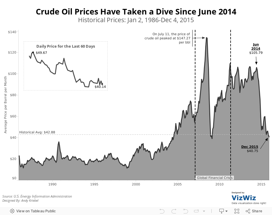
So, given this list of concerns, I've created this visualisation that shows:
- The entire timeline from 1986-2015.
- I note key events that were occurring in the financial markets.
- I made the whole viz simpler and cleaner. Notice the absence of colour.
- I included the historical average for context (things aren't as bad as the original viz makes things out to be).
- I included a close-up view of the daily oil price for the latest 60 days.
Feel free to download the viz and create your own version.
Subscribe to:
Post Comments
(
Atom
)


No comments
Post a Comment